


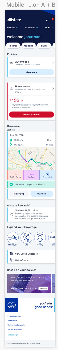
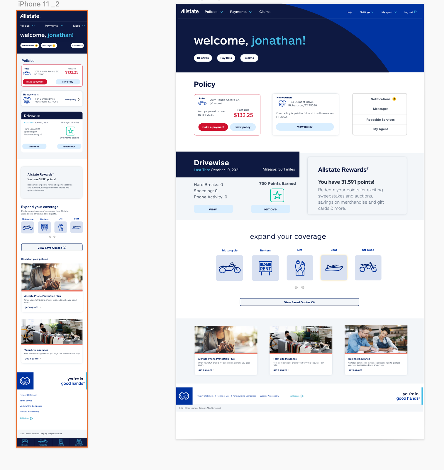
An exploration of the authenticated Homepage of Digital Account.
The purpose of the Home page is to surface the most important relevant information a customer may be seeking when they initially log in to their account
Focus Problem
To create an authenticated home page that supports non-PPL and PPL products (circle of protection) and brings together the best of both current My Account and Mobile experiences.
Design Goals
How can I create a dashboard that allows the customer to take full control of their insurance and personalize their circle of protection?
Design for the complete circle of protection. Keep the design broad and design for Non-PPL and PPL lines of business.
Consider the CFAR user as I design for the customer
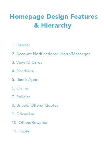
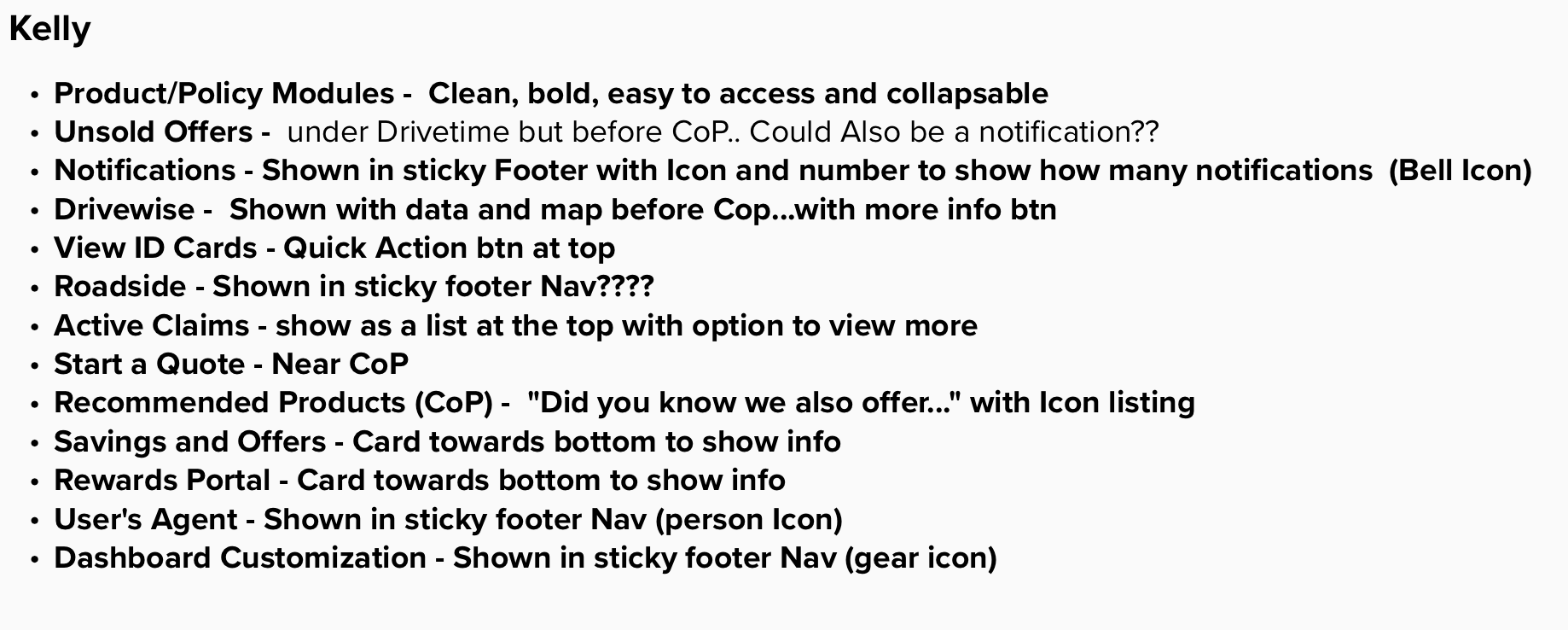
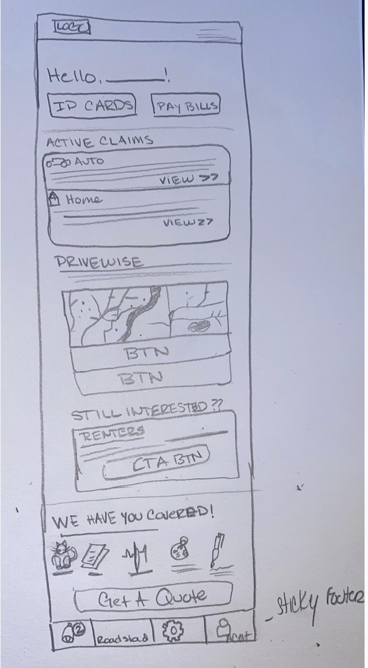
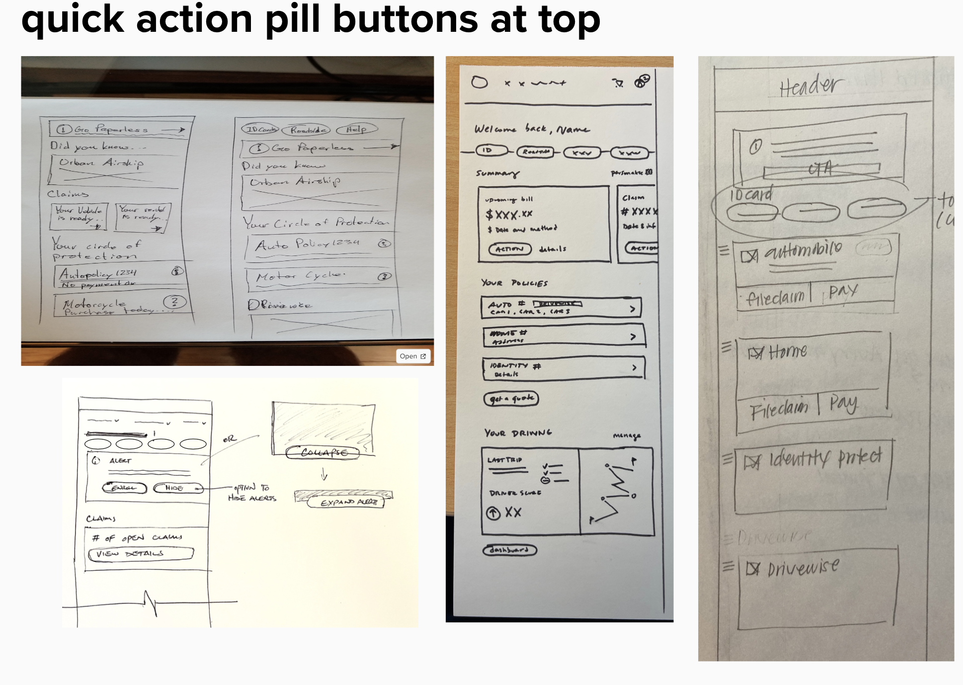
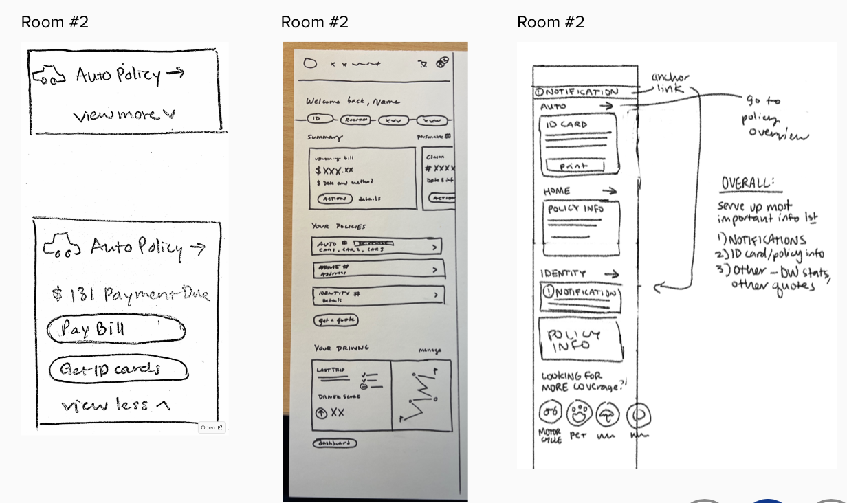
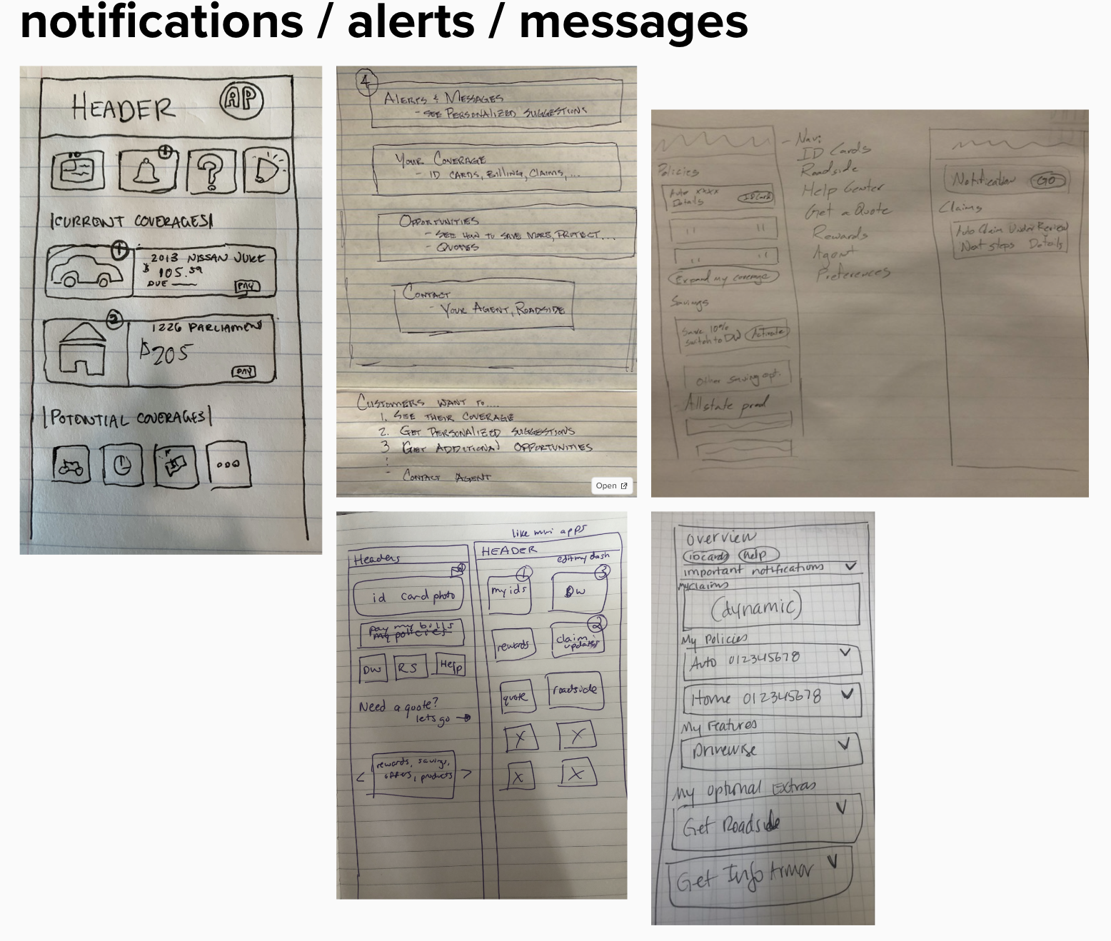
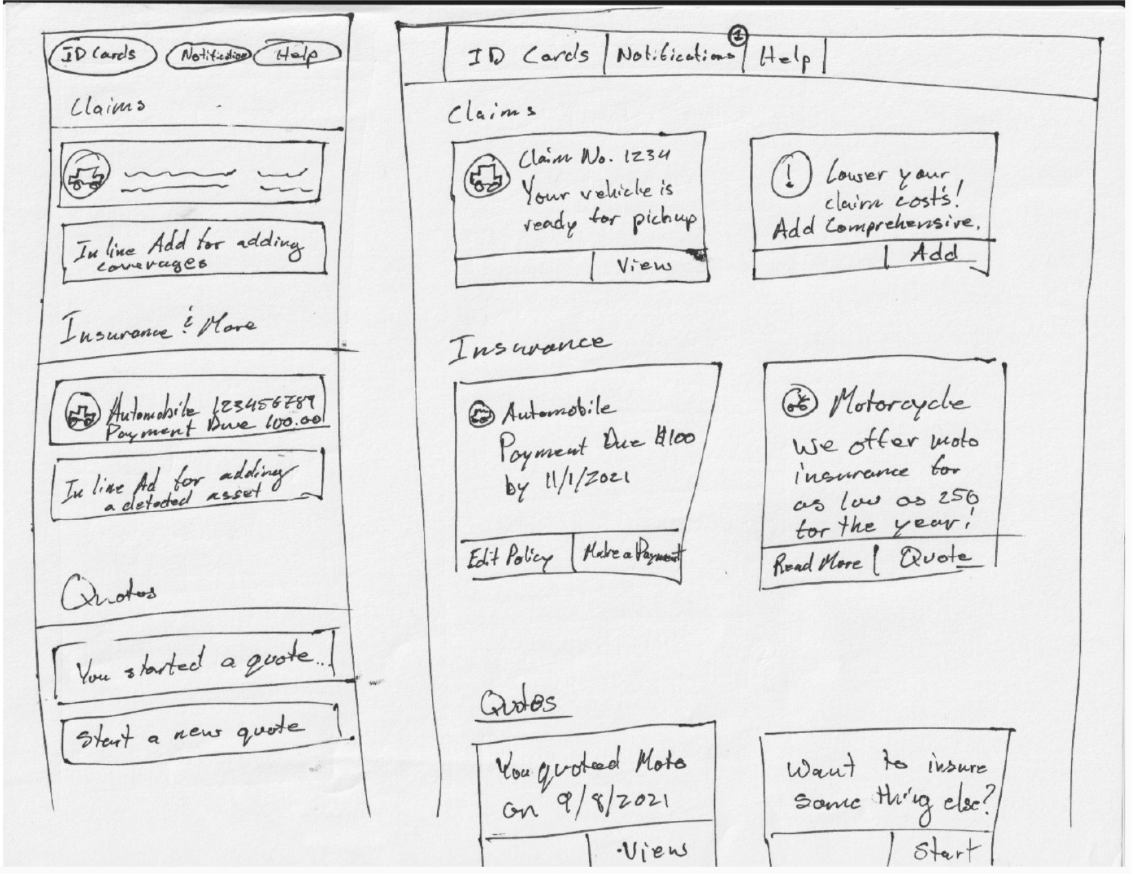
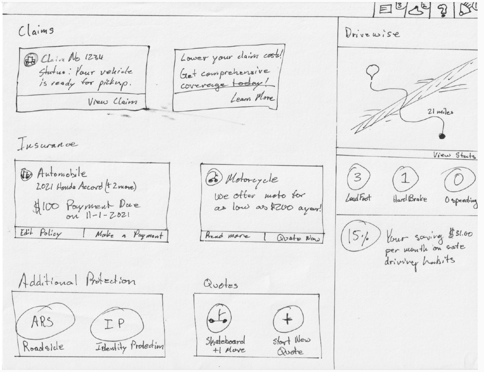
Affinity Groups & Low-Fidelity Wireframes
In this step, my team and I created a rough concept of each feature to show how we thought it should display with sketches and low-fidelity wire frames. We also make note of how each feature should function. We wanted to make sure we were on the same page about hierarchy and content before diving into detailed wireframes.
The main feautre that I wanted to test with our stakeholders was a sticky footer on the mobile view. Allstate has never tried this feature on their mobile view before. I wanted to see if the user would benefit from having highlighted services on their screen at all times without having to scroll to the top or the bottom of the page.
After validating our direction, there were still a lot of details I had to finalize before our team of engineers started building out our version of the feature.
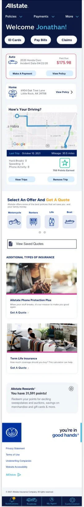
Next I created my high-fidelity wireframes and prototypes using Sketch and Invision.
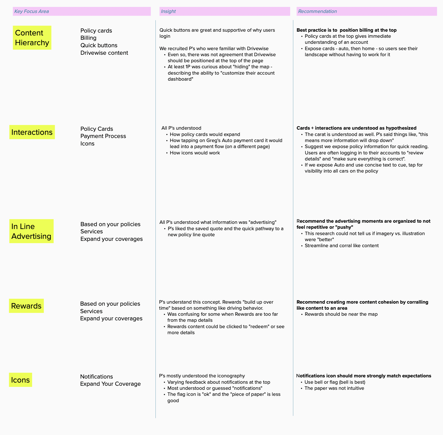
High-Fidelity Design Reviews with Team
Before going into User Testing, the team evaluated our designs and make notes and comments about what they believe worked and didn’t work in effort to achieving our goals.
The extended team would place notes and comments on each one of our designs. This helped us decide if there were any tweaks that needed to be made before going into User testing.
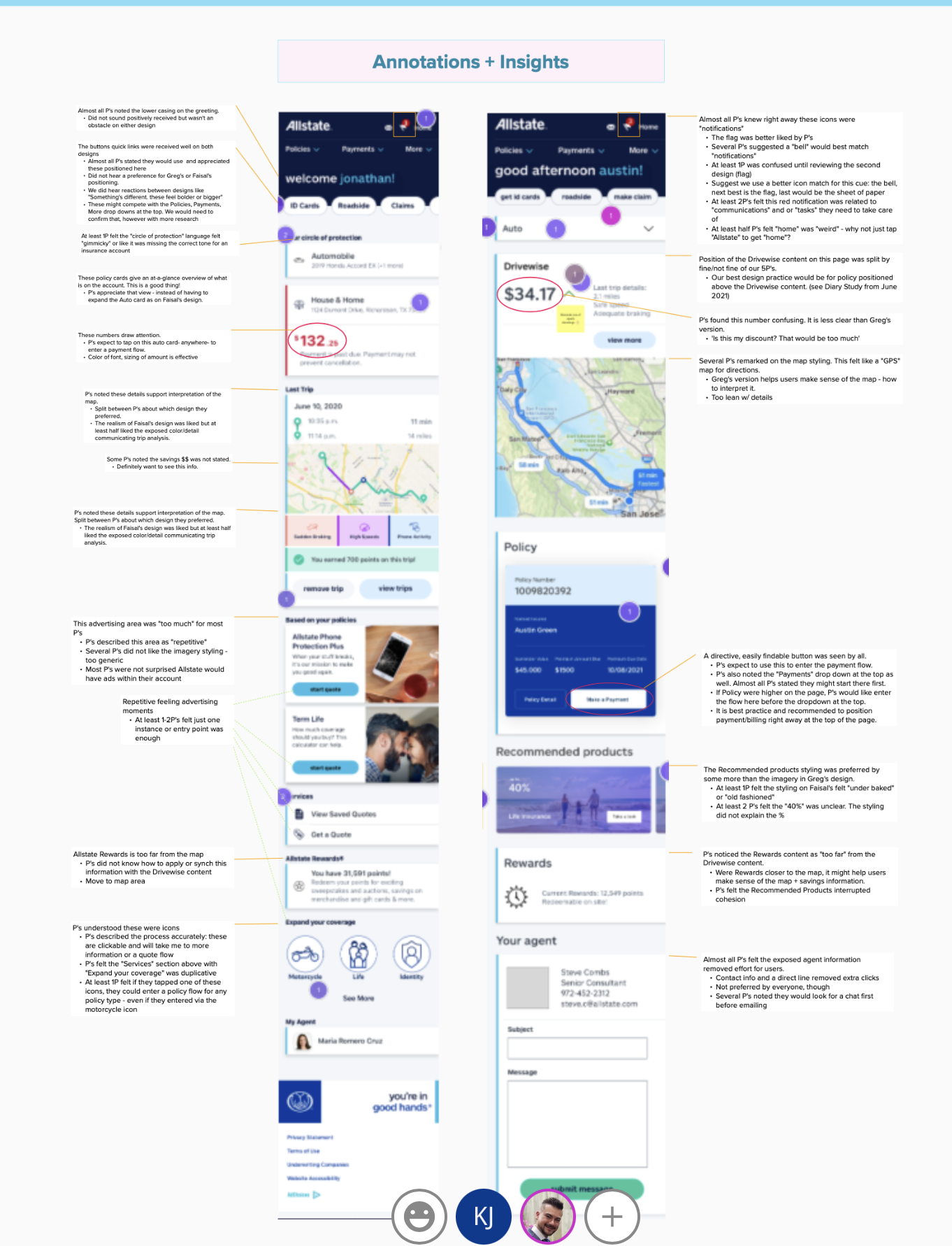
USER TESTING SESSIONS
During user testing, 2-3 participates were selected based on the companies target demographic. The moderator would show them our designs at random and build them through a series of questions.
The goal was to see their genuine reaction and to evaluate the thought process behind some of the choices that were made as they navigated throughout our designs.
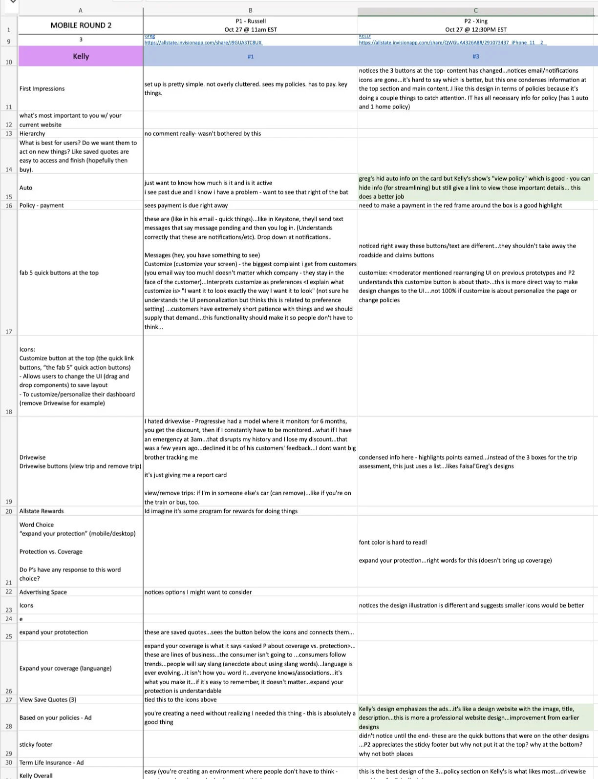
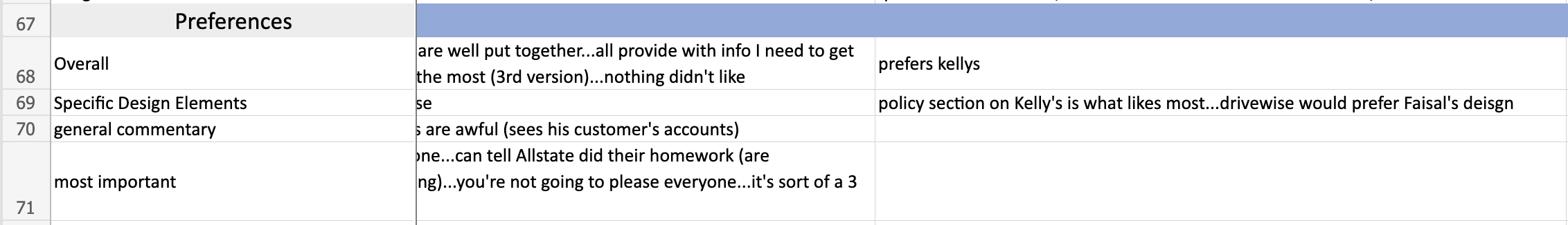
Moderator Notes From User Testing Sessions
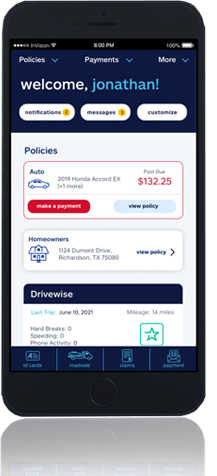
PROJECT OVERVIEW
When design the desktop and mobile view, I wanted to keep in mid that the user should be able to find the features that they are looking for without too much thought. I wanted it to be almost second nature of “muscle memory” when the are navigating through the platform.
Since this was only a short contract, I made sure that I asked a lot of questions in regards to what has worked and what didn’t work from previous designs and the functionality of the features. Having this information allowed the chance to design a clean, modern and easily functioning design that users, based on the testing results, preferred.
I thoroughly enjoyed this project with Allstate. I believe I was able to make a good impact and provided cleaver and clean input into the creation of this feature.