

CHECKOUT & PAYMENT
FLOW
PROJECT OVERVIEW
As part of an automotive subscription platform mobile experience, I redesigned the checkout and payment flow to simplify how users add, select, and manage payment methods. The new design reduces friction, increases clarity, and improves user confidence when completing purchases or subscriptions.
MY ROLE
As the Product Designer on this feature, I worked cross-functionally with product, engineering, and payments partners to simplify the checkout experience. I defined the payment wallet architecture, clarified interaction rules, created success/error patterns, and designed the add/select/update flows used across multiple subscription services.
TOOLS


PROBLEM STATEMENT
The previous payment flow was fragmented and confusing. Users struggled with expired cards, unclear error handling, and extra steps when updating or selecting payment methods. This led to failed transactions, dropped checkouts, and frustration when users couldn't quickly resolve payment issues.
Problems with
the Old Flow
No clear hierarchy between payment options, rewards, and purchase actions
Ambiguous affordances — users tapped static elements thinking they were interactive
Unclear success feedback when adding a new payment method
User confusion when no default card was pre-selected
Error recovery was unclear when a card had expired or was declined
Adding a new payment method required leaving the screen, increasing abandonment
Although the legacy design is not pictured, research and feedback uncovered major friction points:
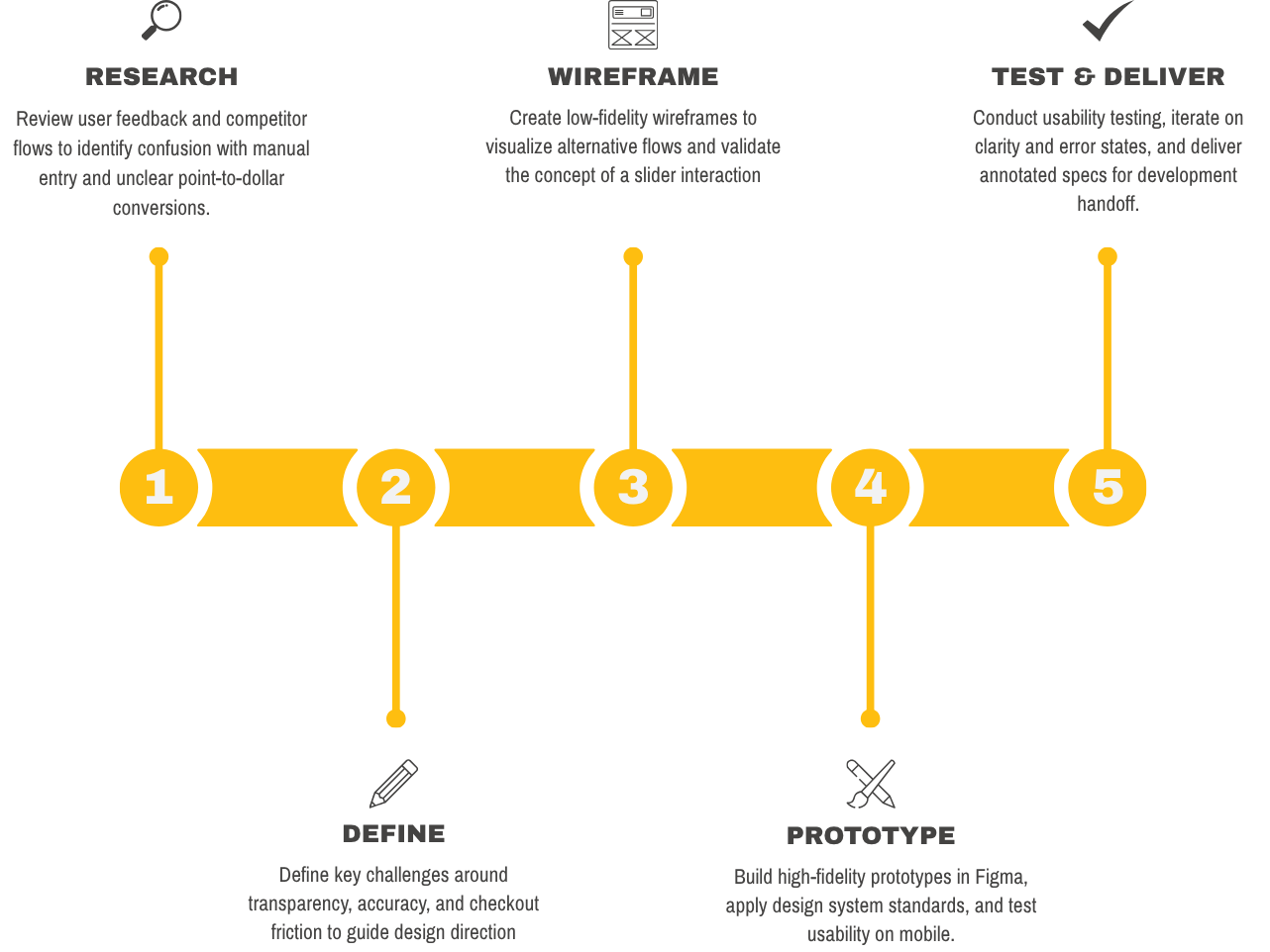
My Process
My SOLUTION
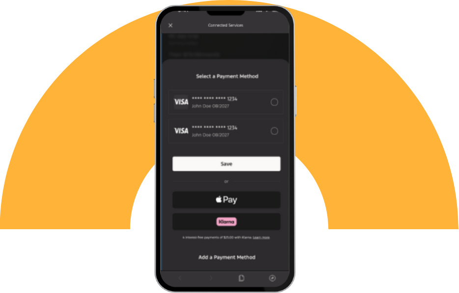
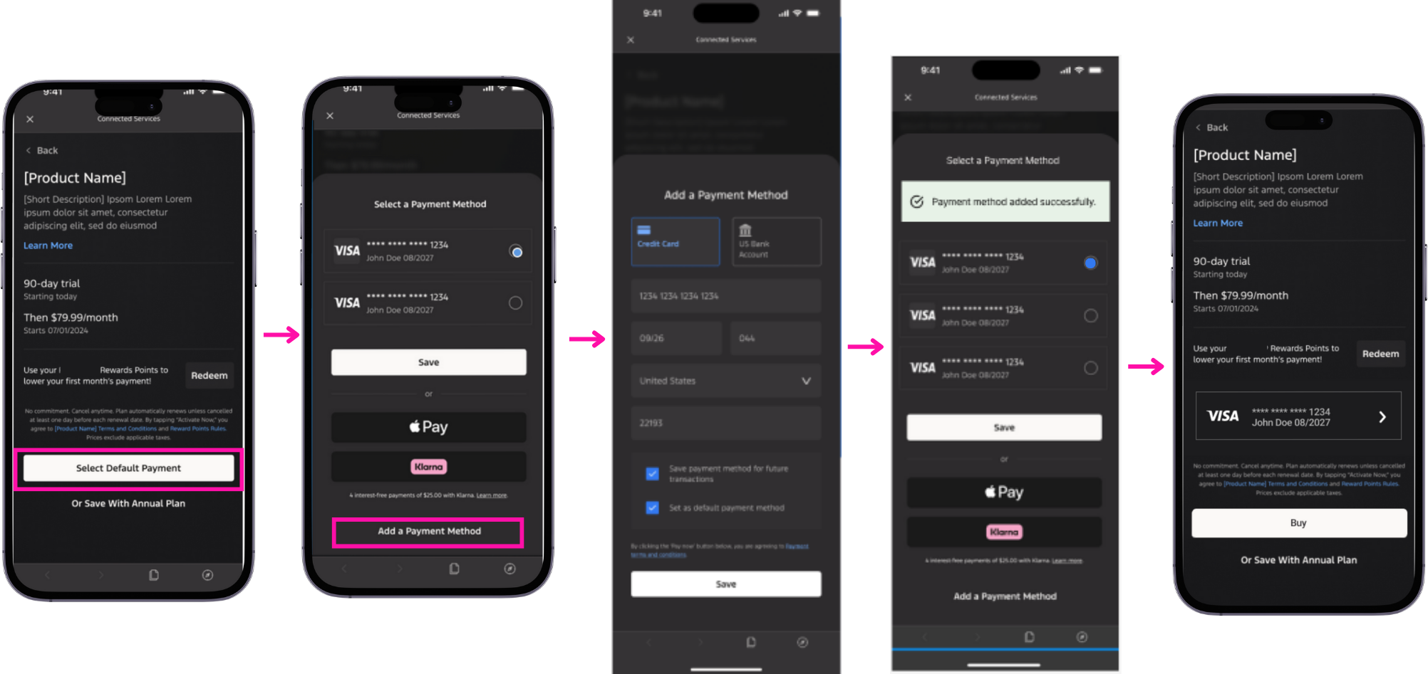
I introduced a streamlined payment selection sheet that consolidates all payment options into a single, focused interface. Existing cards are displayed clearly with selectable states, while newer additions appear instantly without requiring the user to leave the flow. The design now supports effortless entry of new payment methods, with inline success feedback and persistent visibility of the selected card once users return to checkout. I also implemented a more intuitive primary action button, ensuring users understand what will happen next, and supported multiple wallet entries for future flexibility. Together, these improvements reduce friction, shorten the checkout path, and help users feel confident charging the correct payment method.
Card on File
(No Card Selected Yet)
Functionality of
the NEW Flow
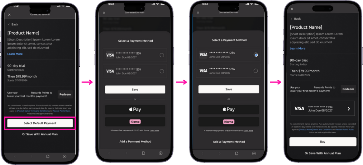
When a user has one or more cards already saved to their wallet, they can tap Select Default Payment to open a payment selection sheet. Here, they can view all stored payment methods, choose the one they prefer, and save that selection so it becomes the active card for the upcoming subscription or purchase. Once confirmed, the chosen method is reflected on the checkout screen, allowing the user to proceed with the Buy action confidently.
This approach reduces decision friction by surfacing all viable payment options in one centralized place. Radio buttons clearly indicate the active selection, decreasing ambiguity about which card will be charged. The flow eliminates unnecessary navigation loops and reinforces trust by showing the exact card on the checkout page. Ultimately, this improves clarity, speeds up the decision process, and lowers the risk of accidental charges to the wrong payment method.
WHY THIS WORKS
No Card on File
(Add Payment Method)
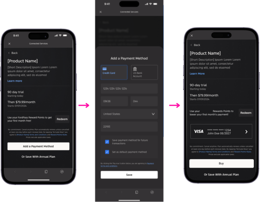
For new users or those without a stored payment method, the checkout experience shifts to surface a single call-to-action: Add a Payment Method. Tapping this opens a dedicated entry form where the user can input card details, set it as their default, and optionally save it for future transactions. Once saved, the payment method is added to their wallet and immediately reflected on the checkout screen for purchase completion.
Functionality of
the NEW Flow
WHY THIS WORKS
Removing unavailable options prevents confusion and guides the user toward the only valid next step. The focused entry form keeps users inside the flow rather than redirecting them elsewhere in the app—reducing abandonment risk. Immediate reflection of the new card provides a sense of successful progress and reinforces confidence. By offering a “save for future use” toggle, the design optimizes long-term convenience without forcing commitment.
Card on File + Add New Payment
In this scenario, the user already has one or more saved cards but chooses to add an additional payment method. From within the Select Payment Method sheet, the user can tap Add a Payment Method, complete the entry form, and save the new option.
The new card is then appended to their wallet and made available for selection. A success banner confirms that the addition was processed, and the user can immediately select this method for the current transaction.
Functionality of
the NEW Flow
This pattern keeps users in context, meaning they can update or expand their wallet without backing out of checkout. Visually appending the new card reassures the user that the action was successful and actionable. Providing the ability to add payment mid-flow prevents dropped checkouts commonly caused by outdated or declined cards. The inline success messaging reduces anxiety, boosts trust, and keeps momentum toward conversion.
WHY THIS WORKS
DESIGNER’S INSIGHT
Through research and user feedback, I learned that payment is one of the most critical moments in the user journey. Even small errors or unclear messaging can cause major frustration and drop-offs. By improving error handling and streamlining card management, I saw how thoughtful design decisions directly reduce friction, build trust, and improve conversion.