Point Redemption Slider
PROJECT OVERVIEW
As part of an automotive rewards platform mobile design, the Point Redemption Slider simplified the redemption process by replacing confusing manual entry fields with an intuitive interactive slider that provided real-time visibility into points-to-dollar value, reduced user errors, and streamlined the mobile checkout experience to build confidence and encourage successful redemptions.
I led the end-to-end UX/UI design process, including research, wireframing, prototyping, and high-fidelity mobile design, while collaborating with product managers and engineers to deliver a scalable rewards redemption experience.
MY ROLE
TOOLS


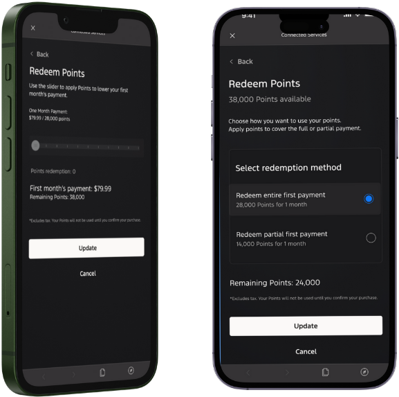
Functionality of
the Old Flow
On the checkout screen, users tap “Redeem” to apply rewards points to their purchase.
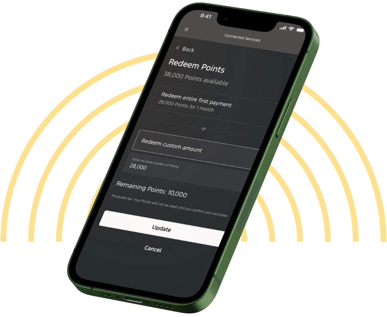
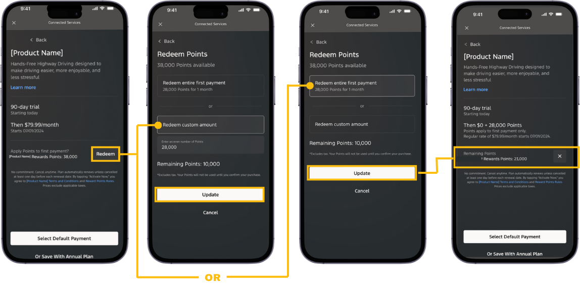
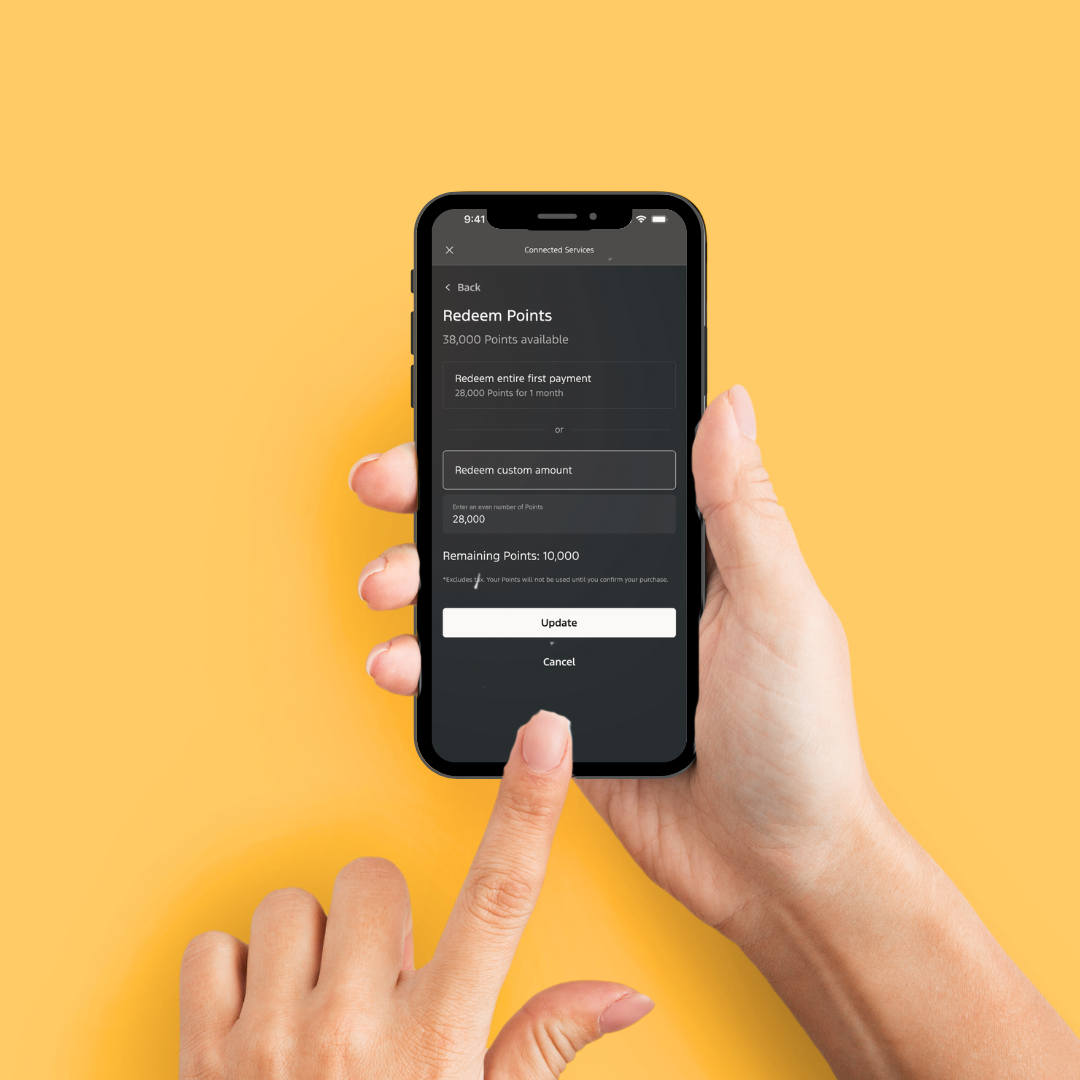
1. Select Redeem
2. Choose Redemption Method
Users pick between redeeming the entire first payment or entering a custom amount.
3. Manual Entry and Update
If choosing custom amount, users must manually type in the number of points and tap “Update” to apply.
The system shows the updated payment balance and remaining points, but only after the user completes the previous steps.
4. Confirmation Screen
PROBLEM STATEMENT
The rewards redemption process required users to manually enter custom point amounts, which caused confusion, errors, and uncertainty about the value of points and ultimately led to frustration and checkout abandonment in the mobile experience.
Problems with
the Old Flow
Complex and Confusing – Manually entering custom point amounts created unnecessary mental effort and made the redemption process harder than it needed to be.
Unclear Value – The point-to-dollar conversion was not obvious, leaving users uncertain about how much their points were actually worth.
Error-Prone and Low Confidence – Manual input increased the risk of mistakes, added extra steps, and left users unsure if their points would be applied correctly until the very end.
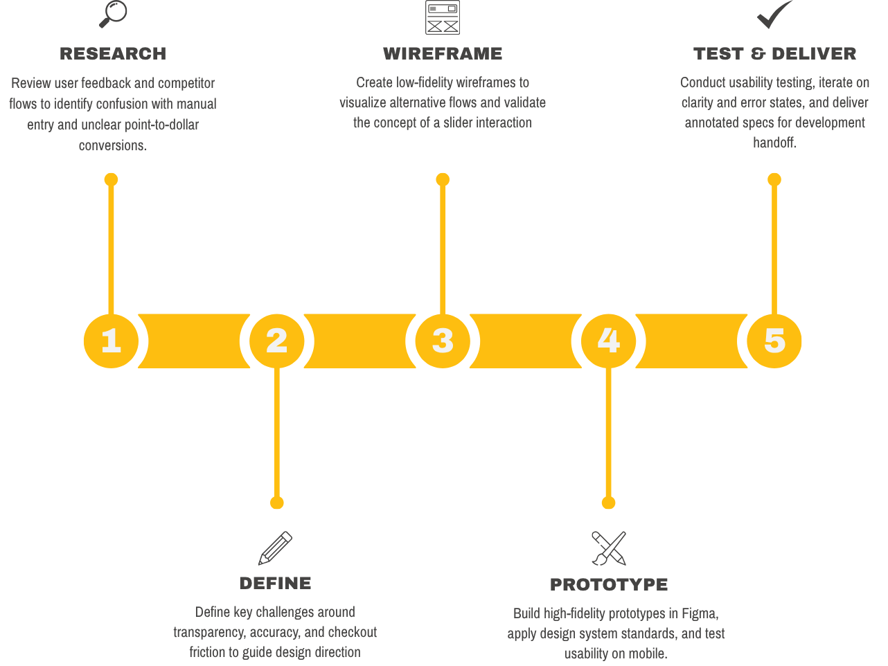
My Process
DESIGN
EXPLORAIONS
I created early high-fidelity explorations to test multiple design directions, compare usability, and refine the solution before finalizing.

The redesigned Point Redemption Slider allowed customers to drag a slider to instantly see how many points they could redeem and the corresponding dollar value. This eliminated manual entry errors, increased transparency, and streamlined the checkout experience.
My SOLUTION

Functionality of
the NEW Flow
1. Select Redeem
On the product checkout screen, tap the “Redeem” option.
2. Adjust the Slider
Drag the slider to choose how many points to apply.
3. See Real-Time Value
Instantly view how points translate into dollar value and how much remains to be paid.
4. Confirm & Checkout
Tap “Update” to apply the points, then review the confirmation summary with updated balance before completing checkout.
I designed the slider to remove the complexity of manual entry and give users instant visibility into their points-to-dollar value. This works because it reduces cognitive load, minimizes errors, and builds confidence by showing savings in real time, making the checkout experience faster and more transparent.
WHY THIS WORKS

DESIGNER’S INSIGHT
Through research and user feedback, I discovered that customers found the manual point entry process confusing, time-consuming, and prone to errors. Many users were uncertain about the true value of their points, which created hesitation and frustration during checkout. The introduction of the interactive slider directly addressed these pain points by providing instant clarity, reducing cognitive load, and increasing user confidence. This project reinforced the importance of listening to user feedback and validating design solutions through iteration, as even small improvements in transparency and usability can have a significant impact on both customer satisfaction and business outcomes.