
Authenticated HOMEPAGE
PROJECT OVERVIEW
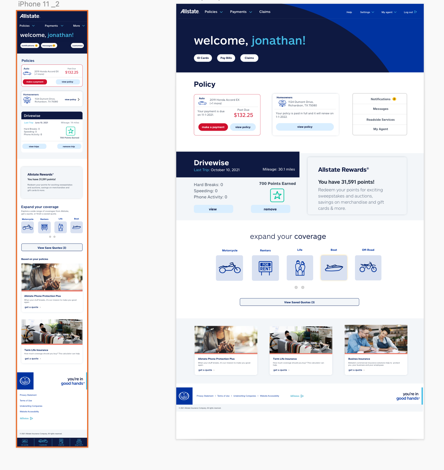
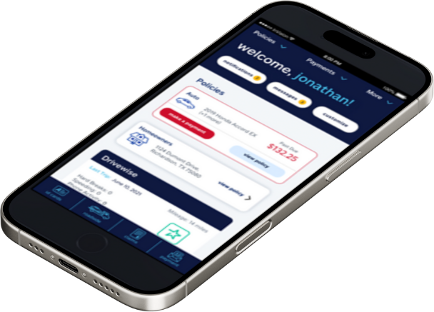
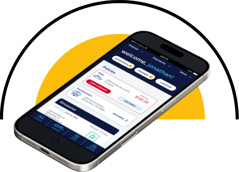
The Authenticated Homepage redesign focused on improving how users interact with their personal dashboard once logged in. The goal was to make essential policy information, claims, billing, and driving data instantly visible while reducing the number of taps required to take key actions such as paying a bill, viewing ID cards, or managing coverage. This new design introduces a more personalized, data-driven experience that helps users quickly complete tasks and understand their overall account status at a glance.
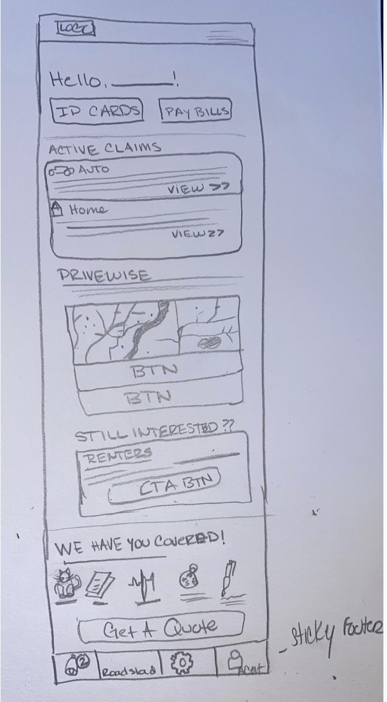
I served as a Product Designer, responsible for defining the structure, flow, and visual hierarchy of the authenticated dashboard. I led the initial concept sketches, wireframes, and prototypes, working closely with product and engineering partners to ensure feasibility and scalability. My work included designing new interaction models for quick actions, alerts, and policy cards, along with testing variations for content prioritization and navigation behavior.
MY ROLE
TOOLS


Research revealed that users wanted immediate access to the most important tasks: viewing bills, making payments, checking claims, and accessing ID cards. I also conducted usability reviews and journey mapping sessions to uncover cognitive friction within the existing dashboard. Insights showed that users:
Frequently returned to the homepage for routine actions.
Struggled to differentiate notifications, alerts, and messages.
Desired a consolidated view of all active policies in one place.
These findings guided the creation of “quick action pills,” contextual alerts, and expandable sections within a single cohesive interface.
Research & Discovery

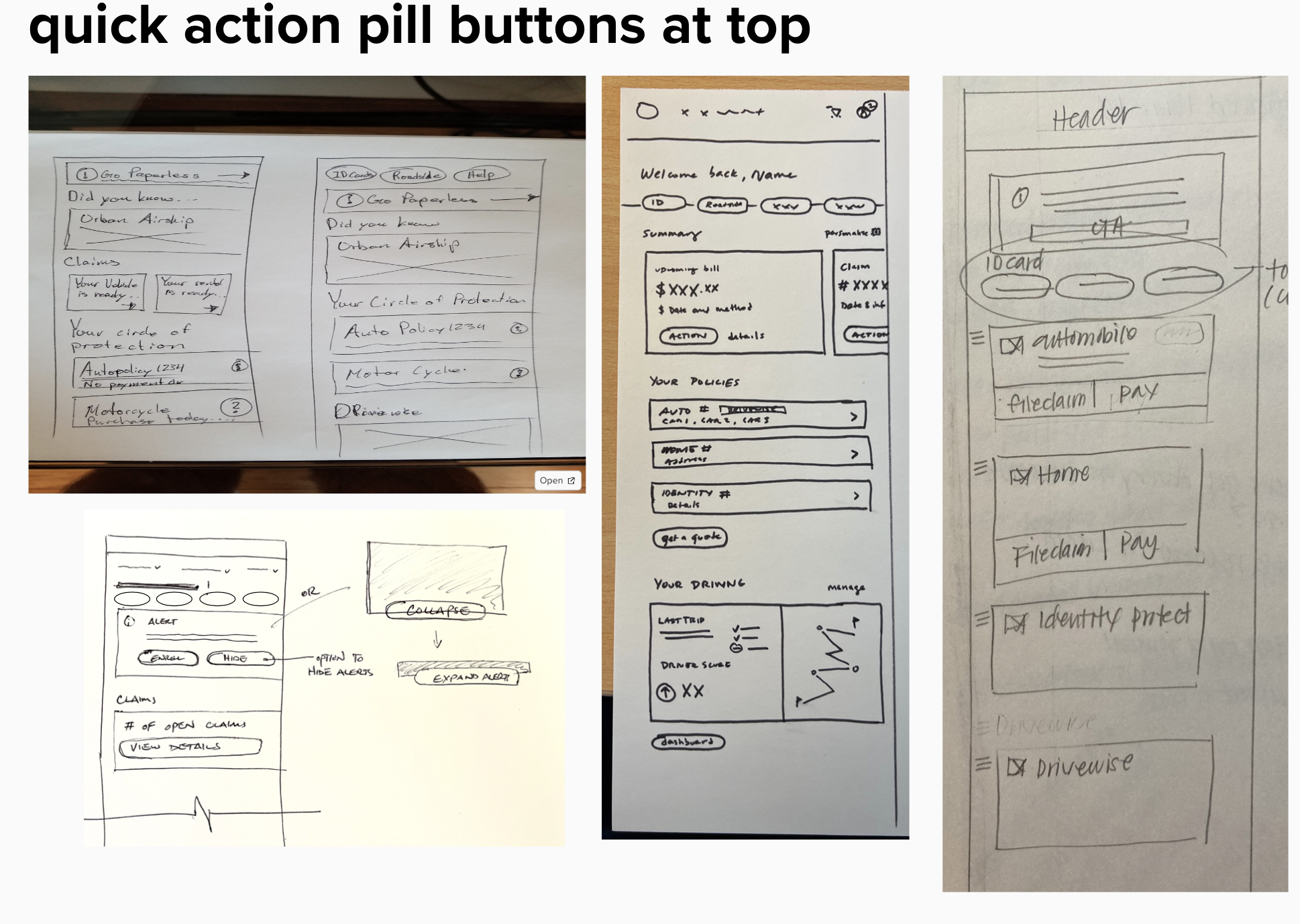
Quick Action Pill Buttons
Functionality of this Flow
The top of the homepage features horizontally scrollable pill buttons that represent high-priority utilities (ID Cards, Roadside Assistance, Notifications, Help, etc.). These buttons remain fixed for immediate reach and update contextually based on user state.
By surfacing the most frequently used actions above the fold, users can complete their goals faster and with fewer taps. This reduces frustration, shortens task time, and creates a sense of control from the moment they log in
Why this WOrKS
Collapsed / Expand Policy Modules
Functionality of this Flow
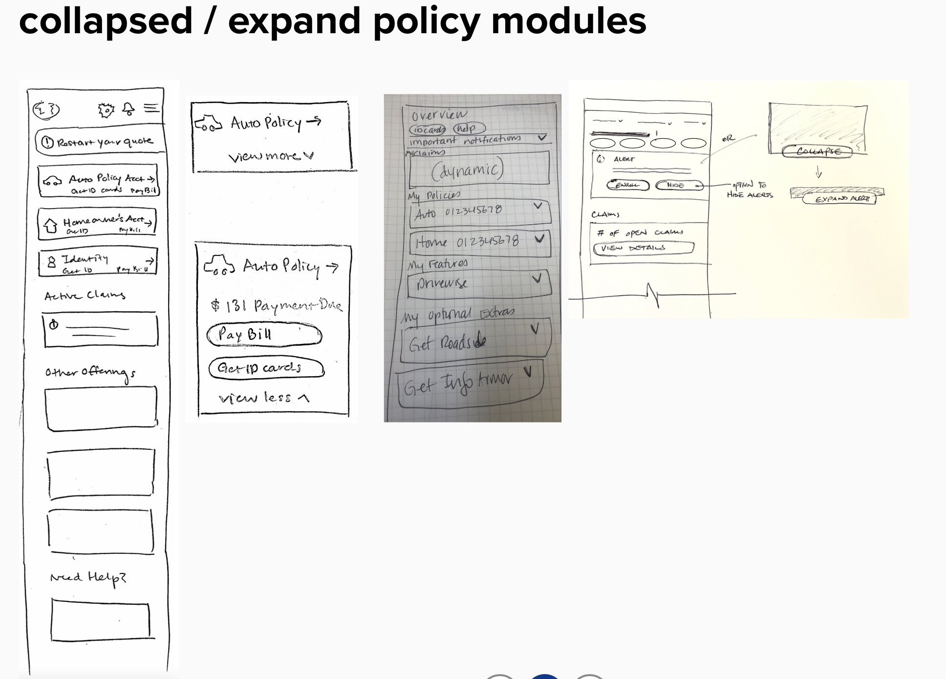
Users can expand or collapse each policy card (Auto, Home, Identity Protection, Drivewise) to reveal quick actions like Pay Bill, Get ID Cards, or View Policy Info. The default collapsed view keeps the homepage clean and shows only key details like payment due dates or notifications.
Why this WOrKS
This accordion-style layout gives users control over how much information they see while keeping critical actions within reach. It minimizes clutter, supports quick scanning, and helps users complete tasks without leaving the homepage—making navigation faster and more intuitive.
Notifications / Alerts / Messages
Functionality of this Flow
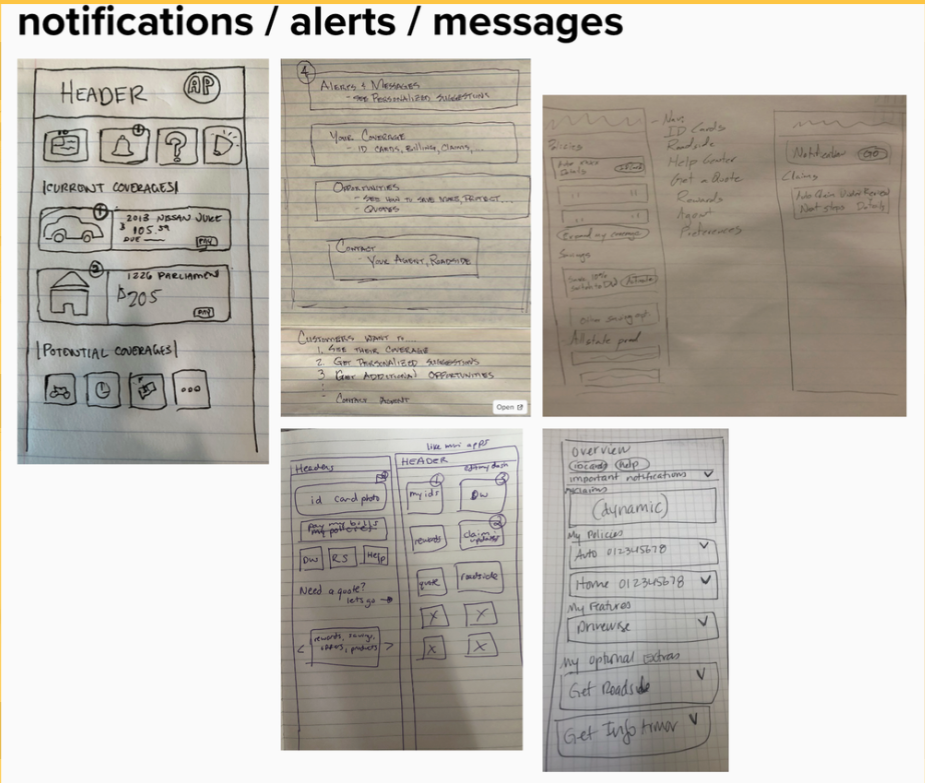
This flow organizes all user communications to include notifications, alerts, and messages into clear, prioritized sections. Users can view important updates like billing reminders, claim progress, and personalized coverage suggestions directly from the homepage header. Each category is expandable for more details, helping users stay informed without leaving the main dashboard.
Why this WOrKS
By centralizing alerts and messages, users no longer need to dig through multiple menus to find updates. The separation between notifications (informational) and alerts (actionable) improves comprehension, while expandable containers prevent visual clutter. This system builds trust by making important updates transparent and easy to manage.
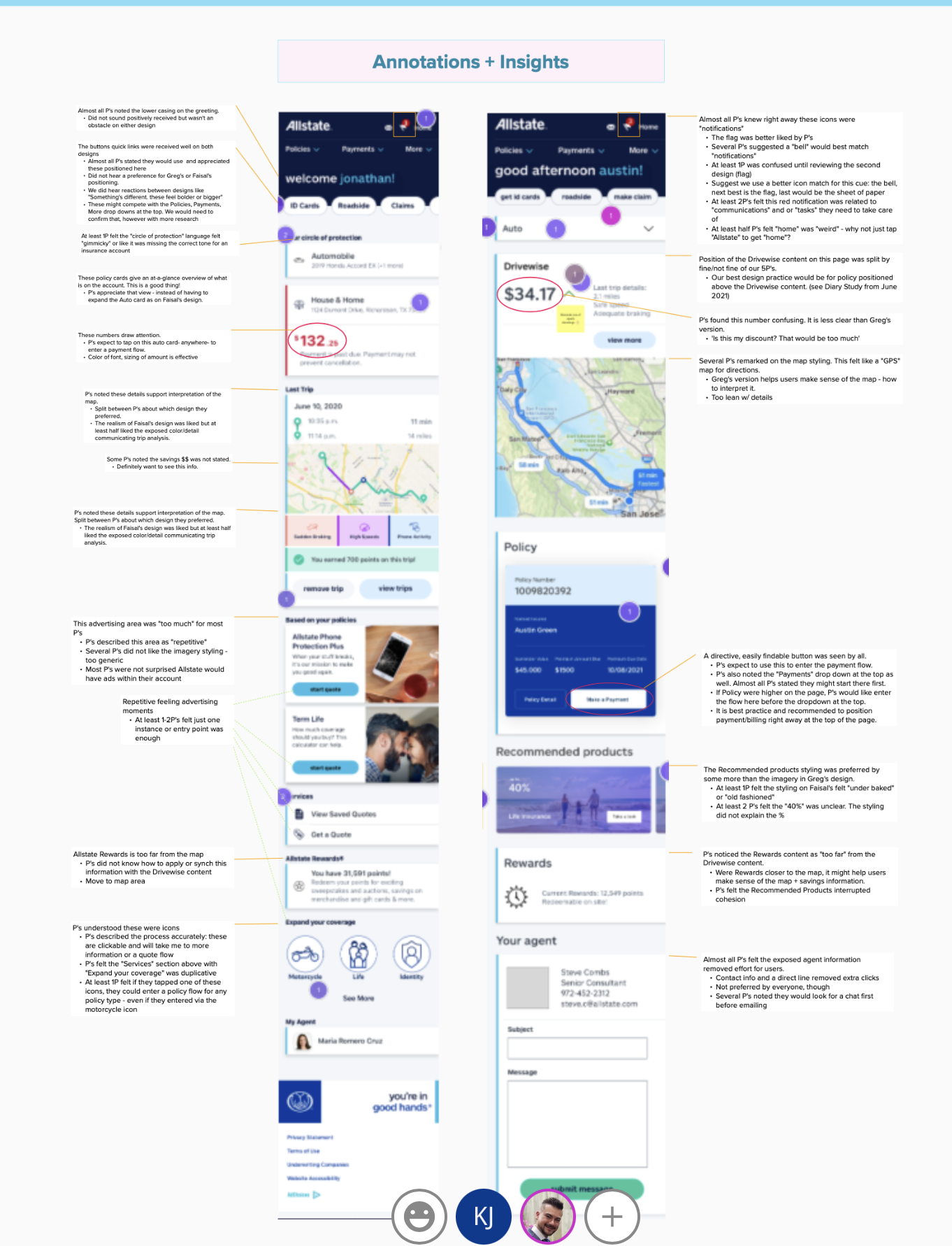
Moderator Notes from
User testing sessions
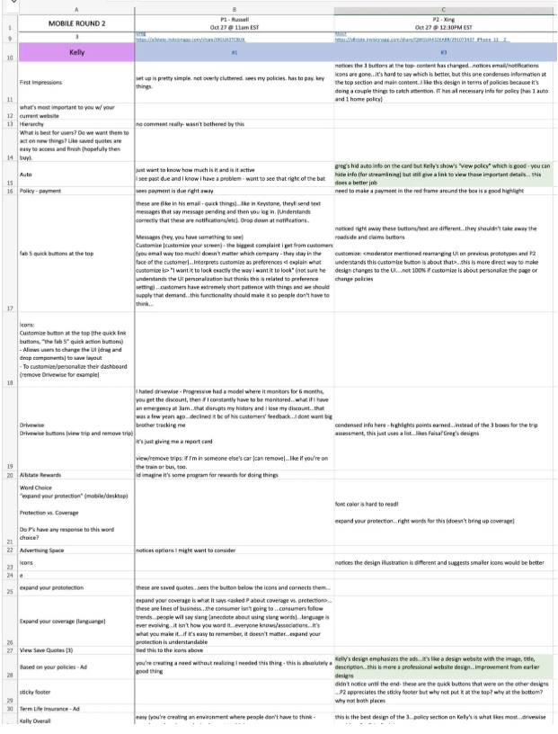
During user testing, 2-3 participates were selected based on the companies target demographic. The moderator would show them our designs at random and build them through a series of questions.
The goal was to see their genuine reaction and to evaluate the thought process behind some of the choices that were made as they navigated throughout our designs.
The redesign aimed to create a personalized, task-oriented homepage that balances information density with clarity. My primary goals were to:
Enable users to complete high-frequency actions (payments, ID cards, claims) directly from the homepage.
Present key information like due dates and alerts without clutter or confusion.
Build an adaptable layout that scales across multiple policy types (auto, home, identity protection, etc.).
Strengthen engagement through contextual prompts and dynamic data summaries.
Design Goals
I restructured the authenticated homepage around three core pillars: quick access, personalization, and transparency.
At the top, I introduced quick action pill buttons (e.g., ID Cards, Roadside, Rewards, Help) so users can instantly access core functions without scrolling. Below that, each policy card surfaces real-time billing and claims data, allowing users to pay bills or view ID cards in one tap. Notifications and alerts are clearly differentiated with dynamic banners and collapsible sections, reducing cognitive load while maintaining visibility for urgent tasks.
The layout uses modular containers that can adapt to any combination of policies, ensuring consistency for both new and returning customers. Finally, the inclusion of driving analytics through “Drivewise” introduces a personalized performance layer that keeps users engaged beyond transactions.
My SOLUTION